The Core Concept: Fluidity Meets Innovation
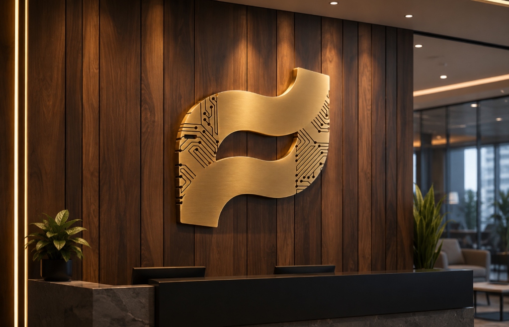
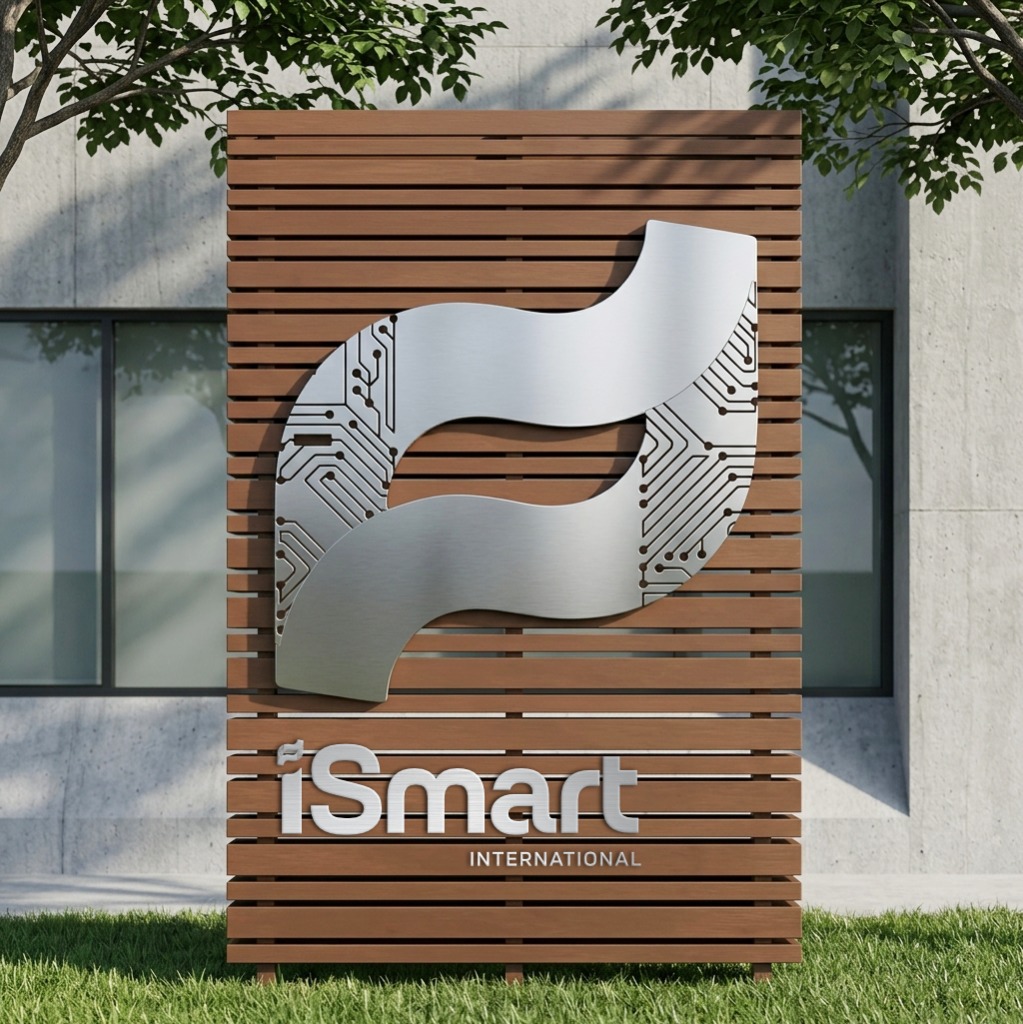
Rather than depicting currency in literal symbols, the iSmart identity abstracts the movement of financial value into a continuous, flowing wave. Rotating this dynamic wave 90 degrees naturally forms a stylized lowercase 'i', yielding a distinctive mark inextricably tied to iSmart.
1. The Payment Wave
Symbolizes the fluid forward momentum of capital, seamless digital transactions, and frictionless cross-border value transfer.
2. Technology Circuitry
Subtle microchip and PCB trace geometries embedded into the curves signify intelligent infrastructure, uncompromised security, and enterprise connectivity.
3. Smart Simplicity
A unified mark communicating smart, accessible financial innovation that empowers both corporate enterprises and local market vendors.
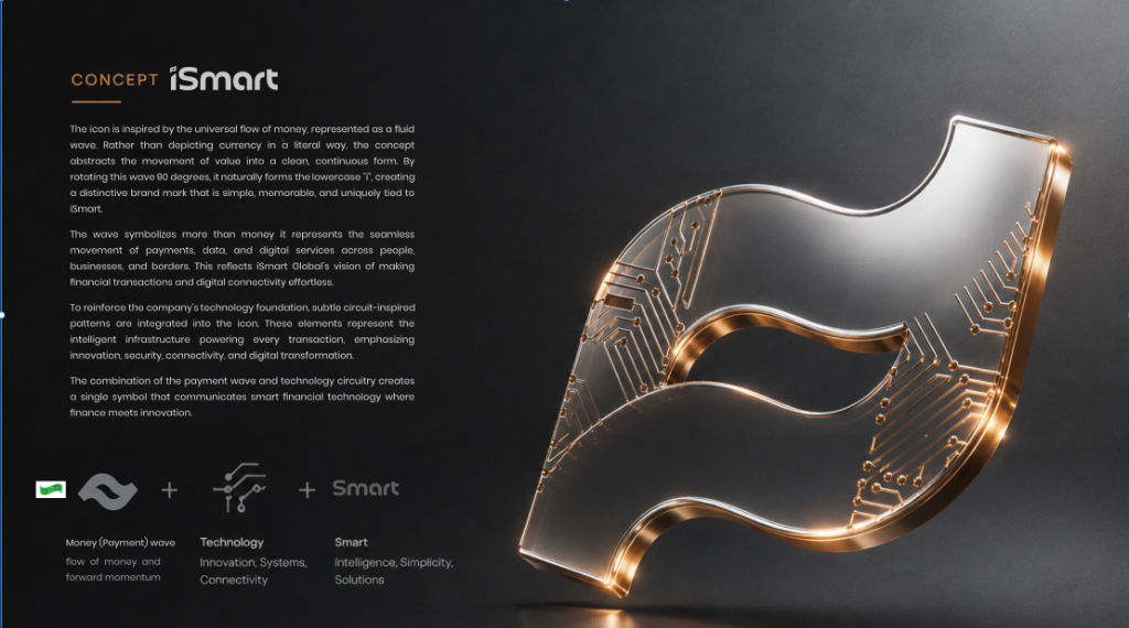
Concept Blueprint: Visual formulation blending payment fluidity, technical circuitry, and the signature lowercase 'i' brand mark.